
NOTE 07/09/23: this is the fourth in a series of posts called “Photoshop Quick Tips” – In this and further “Quick Tip” posts, you’ll discover basic but fundamental aspects of Photoshop, presented in bite-sized pieces – – short, concise, succinct, and to-the-point – enjoy!
The “Quick Tip” video below is a snippet from one of my free live & online “Photoshop 101” Meetups – the full recording (& notes) can be found here: https://blog.main.wattsdigital.com/video-photoshop-101-class-2-control-your-contrast-color-07-22-20/
_______________
“The color balance in my print doesn’t look right…”
Color Correction is correcting an imbalance in the color cast of an image – either globally or locally. One of the “tools” to help you determine the proper color balance is the Color Wheel.
How many of us have looked at our print or image, and know that there’s something not quite right about the color balance?
Let’s go over some basics of Color Correction – then you can color correct with more confidence and accuracy – knowing what you’re aiming for in your final print or image!
Key Point – Using “Neutrals”:
When judging the overall color balance in your image, look for “neutral” colors, such as whites or grays – clouds in the sky, silver cars, a white picket fence, or street pavement are good examples.
Why? Because this is where improper color cast issues show up first – not in a bright primary color, such as Fire Engine Red.
So, by correcting for an improper color cast in those neutrals, you’ll be improving the overall color balance of the image considerably.
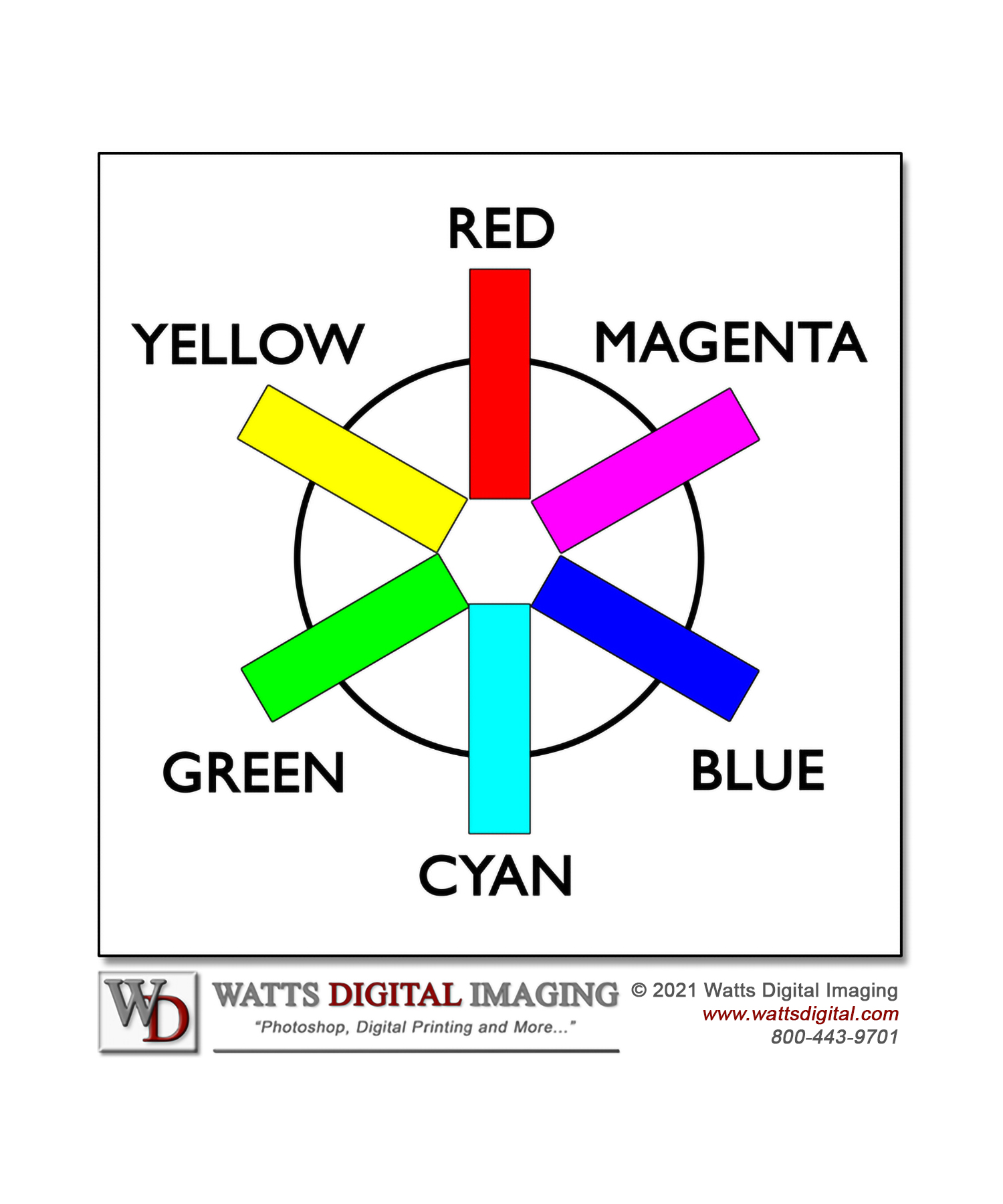
The Color Wheel:
-
The Color Wheel will help you visualize how the Primary Colors in photography:
Red, Green, & Blue
… and their corresponding Complementary Colors:
Cyan, Magenta, & Yellow
… interact with each other to achieve proper color balance.
- By the way, this is where the acronyms RGB & CMYK are derived.
Correct using the Color wheel – How it Works:
- A Primary Color is opposite its corresponding Complementary Color in the Color Wheel, such as Blue (Primary) is opposite of Yellow (Complementary).
- So, to correct an image with an improper color cast, add that color casts’ opposite (in the Wheel) to bring the color balance back to the desired values, using the “Neutral” concept above to guide you.
- Here’s a simple example: let’s say that by looking at the “neutrals” in an image, the neutral color cast is too blue; add yellow to correct the improper color balance.
Finer Points on Using the Color Wheel
- Point #3 above may be over-simplifying things a bit, because in the “real world”, true primary or complementary colors are rarely captured in digital form. Bottom line, you may need to use a combination of two colors to correct your image.
For example, let’s say your image has an orange cast (which is Red + Yellow) – to correct, you would add a combination of Blue + Cyan (the opposite colors in the Wheel).
- Rules are made to be broken, so you should know that the “Neutral concept” doesn’t always apply – – a sunset is a perfect example, as it needs to stay nice and warm.
- You can describe a color by adding the two surrounding colors in the wheel — for instance, Yellow + Magenta =
______________________
• AVAILABLE NATIONWIDE – for more on my free live & online Photoshop Meetups, click here:
https://wattsdigital.com/free-live-meetups-online
• More Photoshop videos at my YouTube Channel:
https://www.youtube.com/user/wattsdigitalvideos
• Was this information helpful?
Sign up for my free monthly newsletter here …
• By the way, this is all based on my Photoshop book designed for photographers, “Not just another Photoshop Book”, available as eBook (immediate PDF download) or paperback from Amazon:
https://wattsdigital.com/photoshop-book-e-book
Questions? Please contact me – also, feel free to comment and forward this to your photography friends!
Thx again, and cheers,
John Watts ?